Dashboards “by objects”
When creating a new dashboard, select the By objects type and click Create. An empty workspace will open. Here,
you can add widgets – the main elements of the dashboard.

1 – Add new widget: Add a widget to the workspace
2 – Save: Save dashboard changes
3 – Auto-refresh enabled/disabled:
If the indicator is active, auto-refresh is enabled and the widgets on the dashboard are updated in real time when new data packets are received. If the indicator is inactive, auto-refresh is disabled and the data on the widget is updated only after refreshing the page or switching between platform tabs
4 – Data viewing interval: Configure the data viewing period on the dashboard
5 – Settings: Manage auto-refresh and enabling the background for the workspace
6 – Export .json: Export the dashboard to a JSON file
7 – Fullscreen: Open the workspace in full-screen mode
Creating a widget
Widgets are the building blocks of a dashboard. They can be used both to visualize data and to interact with devices
by sending commands. To create a widget, click Add new widget. A configuration panel opens on the right.

💡
A dashboard can contain up to 15 widgets.
Select a widget type. The available configuration fields will change depending on the selected type.
Available widget types:
- Line chart – a chart of data changes over time. This widget can be used to track temperature, energy consumption, and other sensor readings;
- Pie chart – a circle divided into sectors, where each sector reflects the share (percentage) of the value of one argument relative to the sum of the values of all arguments selected as a data source. This widget allows you to quickly compare a small set of values and evaluate the share of each value compared with other sectors and with the entire pie chart. For example, it can be used to display the duration of equipment operation in different modes, or incident causes by category;
- Gauge chart – a half-ring chart divided into sectors, where each sector reflects one of the levels set in the model for the argument selected as the data source. This widget allows you to quickly see which interval the value falls into within the specified range. For example, it can be used to display the speed of a vehicle within established limits;
- Percentage – a ring chart where the percentage fill share for the argument selected as the data source is highlighted in color along the circumference. This widget makes it easy to visualize a value in the range from 0 to 100 percent. For example, it can be used to assess battery charge, task completion progress, or equipment load level;
- Bar gauge chart – a chart in the form of vertical or horizontal bars, where the height or length of each bar corresponds to the value of the argument selected for it. This widget is convenient for creating a ranking when values need to be compared with each other and attention needs to be focused on the best and worst indicators, or for comparing values across different categories;
- Counter – the numeric value of an argument with a specified color, which can change according to levels;
- LED – a virtual LED that signals the state of an argument;
- Battery, Flask, Thermometer – schematic images of a battery, flask, and thermometer respectively, where the percentage fill share for the argument selected as the data source is highlighted in color;
- Text – plain text or text in Markdown format. This widget
allows you to add contextual information and descriptions. For example, it can be used
- for important links or useful annotations;
- for instructions or recommendations on interpreting various widgets, configuring parameters, or performing specific actions based on the displayed data;
- for an announcement about scheduled maintenance or downtime;
- Slider is intended for sending a command with a variable numeric value. For example, it can be used to change light intensity, engine operating speed, or to set a specific program number;
- Switch is a two-position button for turning something on/off;
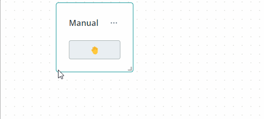
- Button is intended for sending any object command;
- Stepper, like a slider, allows you to send a command with a variable numeric value, but in this case the value can be changed only by a predefined step;
- The Color widget is well suited for selecting an exact color using the RGB scheme — for example, for setting the color of an LED or lamp.

Next, you can specify the widget name and description. The name will be displayed at the top of the widget window, and
the description at the bottom.
In the Display settings section, you can manage the widget window border, the format of the data displayed on the
widget, the chart style, and the legend. All settings are presented in the table.
| Setting | Where used | Description |
|---|---|---|
| Show border | All widgets | Show or hide the border around the perimeter of the widget |
| Border color | All widgets | Set the widget border color |
| Number of decimal places | Line chart, Bar chart, Pie chart, Gauge chart, Bar gauge chart, Counter, Battery, Flask, Thermometer | Select the number of decimal places for widget data |
| Style | Line chart | Select the style for displaying widget data on the chart: Default, Only points, Area, Dotted line, Rounded |
| Line width | Line chart | Select the line width for the widget data chart: 1px, 2px, 4px, 8px |
| Point radius | Line chart | Select the size of points for the widget data chart: Do not show, 1px, 2px, 4pxPoint size on the chart = Line width + 2*Point radius |
| Show units of measure | Line chart, Bar chart, Pie chart, Gauge chart, Bar gauge chart, Counter, Battery, Flask, Thermometer | Show or hide units of measurement for widget data |
| Show legend | Line chart, Bar chart, Pie chart, Bar gauge chart | Show or hide the widget legend |
| Legend parameters | Line chart, Bar chart, Pie chart, Bar gauge chart | Select the parameters displayed in the widget legend: MIN, MAX, FIRST, LAST, AVG, DIFF, SUM |
| Legend placement | Line chart, Bar chart, Pie chart, Bar gauge chart | Set the widget legend position: Top, Right, Bottom, Left |
| Min, Max | Bar gauge chart, Battery, Flask, Thermometer | Set boundary values for displaying widget data |
| Data output order | Bar gauge chart | Set the sorting order for widget data: Default – the order is fixed and corresponds to the sequence of added data sources; Ascending/Descending – the order is dynamic and depends on data source values |
| Use "decimal places" value from the model | Counter, Battery, Flask, Thermometer | Set the number of decimal places for the argument selected as the widget data source to the same value as defined in the model. |
The Widget preview section shows how the widget will look based on your current settings using randomly generated
sample data.
💡
Even after you add a data source, the Widget preview still displays randomly generated values. To see actual object
data, open the widget on the main dashboard.

Widgets are connected directly to object parameters and commands. Data source selection and configuration are handled in
the Data source section and vary depending on the widget type.
Line chart
Select one or more objects of interest. For each object, specify the arguments whose values will
be used as data sources. In the list of parameters available for selection, only those that have the
Number data type specified in the model are available. In total, across all objects, you can add up to 20 arguments.
You can also rename the data source and set your own color for each argument.

Click Save. A new widget will appear on the dashboard. By default, argument values on the widget are visually
represented as points connected by straight lines.

💡
To configure the chart style, go to the widget Display settings and use the Style, Line
width, and Point radius options. The Widget preview section will show a chart corresponding to your settings. When
you finish editing the widget, click Save.

When you hover over a chart point, it becomes larger and information is displayed about the time this data packet was received,
the data source, and the argument value.

Pie chart
Select one or more objects of interest. For each object, specify the arguments whose values will
be used as data sources. In the list of parameters available for selection, only those that have the
Number data type specified in the model are available. In total, across all objects, you can add up to 20 arguments.
You can also rename the data source and set your own sector color for each argument.

Click Save. A new widget will appear on the dashboard. The value of each argument on the widget is visually
represented as a sector of a circle.

When you hover over a circle sector, it becomes brighter, and the argument name, its value, and the sum of all arguments
in the chart are displayed.

Gauge chart
Select one object of interest. From the list of this object's parameters, determine the argument whose values
will be used as the data source. In the list of parameters available for selection, only those that have
the Number data type specified in the model are available. Set the function for calculating the value displayed on the widget:
-
MIN/MAX – the minimum/maximum value for the selected time period;
-
FIRST/LAST – the first/last value for the selected time period;
-
AVG – the average value for the selected time period;
-
DIFF – the last value minus the first value over the selected time period;
-
SUM – the sum of all values received by the object during the selected time period.You can enable Show edge intervals mode; then the ring chart will be divided into colored sectors according to the levels set in the model for this argument. If this mode is disabled, the chart is fully colored in the color of the level corresponding to the displayed argument value. If the selected argument does not yet have levels set in the model or the interval boundaries and their color do not suit you, click Go to the model and customize levels. After saving the new levels in the model, the sector colors on the chart will also be updated.

Click Save. A new widget will appear on the dashboard.

When you hover over a Gauge chart sector, it becomes brighter and information about the data source and current interval is displayed.

Percentage
Select one object of interest. From the list of this object's parameters, determine the argument whose current value
will be used as the data source. In the list of parameters available for selection, only those
that have the Number data type and the Percents unit of measurement specified in the model are available. You
can set your own color for the percentage fill scale and select the image displayed above the numeric value of the argument.

Click Save. A new widget will appear on the dashboard.

When you hover over the widget, information about the data source is displayed.

Bar gauge chart
Select one or more objects of interest. For each object, specify the arguments whose values will
be used as data sources. In the list of parameters available for selection, only those that have the
Number data type specified in the model are available. In total, across all objects, you can add up to 20 arguments.
You can also rename the data source and set your own bar color for each argument.

Click Save. A new widget will appear on the dashboard. The value of each argument on the widget is visually
represented as a bar.

💡
If the chart is used to visualize changes in an argument's value over time, consider setting a maximum value in the
display settings. The bars will then be scaled relative to this maximum, making it easier to track progress and evaluate
changes at a glance.


If the maximum is not set, then by default the largest current argument value in the bars is taken as the maximum.
When you hover over the bars, information about the data source is displayed.

Counter
Select one object of interest. From the list of this object's parameters, determine the argument whose current value
will be used as the data source. In the list of parameters available for selection, only those
that have the Number data type specified in the model are available. You can set your own color for the value
displayed on the widget, or select Use colors from the levels; then the value will be colored in the color
corresponding to the interval. If the selected argument does not yet have levels set in the model, or you want to change
their color, click Go to the model and customize levels. After saving the new levels in the model, the value color
on the widget will also be updated.

Click Save. A new widget will appear on the dashboard.

When you hover over the widget, information about the data source is displayed.

LED
Select one object of interest. From the list of this object's parameters, determine the argument whose current value
will be used as the data source. In the list of parameters available for selection, only those
that have the Boolean data type specified in the model are available. You can enable Show value; then the Yes/No value
will be displayed under the LED image. By default, the green LED color corresponds to Yes, and red to No.
If this color solution or text does not suit your task, enable Use colors from the levels. If the
selected argument does not yet have levels set in the model, or you want to change their color and the displayed text, click
Go to the model and customize levels. After saving the new levels in the model, the color and corresponding LED status text
on the widget will also be updated.

Click Save. A new widget will appear on the dashboard.

When you hover over the widget, information about the data source is displayed.

Battery, Flask, Thermometer
The configuration of these three widgets is the same. Select one object of interest. From the list of this object's parameters,
determine the argument whose current value will be used as the data source. In the list of parameters available
for selection, only those that have the Number data type specified in the model are available. You can set your own fill color
on the widget, or select Use colors from the levels; then the value will be colored in the color
corresponding to the interval. If the selected argument does not yet have levels set in the model, or you want to change their color,
click Go to the model and customize levels. After saving the new levels in the model, the value color on the widget
will also be updated.

Click Save. A new widget will appear on the dashboard.
Examples of the three widgets are shown below.

💡
By default, the fill on the widget is calculated based on 0 being the minimum value and 100 being the maximum. If
the actual boundary values are different, set them in the display settings.

In this case, the percentage of color fill on the widget is calculated from your values.

Text
This widget is the only one where you do not need to select either an object or an argument. Just write your text in the usual
format or use Markdown markup.

Click Save. A new widget will appear on the dashboard.

Slider
Select one object of interest. From the list of commands for this object, determine the command in whose data
the numeric value set by the slider position will be sent. Set the start and end boundary of the slider, as well as
the default value. You can also set the step with which the slider will move.

💡
In the list of commands available for selection, only those are present that have exactly one parameter set in the model, whose value
can be specified directly when sending the command. To create such a parameter, when creating
the command in the model, it must be declared in curly braces
{{param_name}}.
The same commands are used as data sources for the Stepper and Color widgets.
Click Save. A new widget will appear on the dashboard.

When you hover over the slider scale, information about the current slider value and data source is displayed.

Move the slider to the required position to send the command. Upon successful execution or failure, the corresponding
notification will appear.

Switch
Select one object of interest. From the list of commands for this object, determine the commands that will be sent when
the switch is turned on and off. You can specify the names of states that will be displayed next to
the switch after the corresponding command is sent.

💡
The list of commands available for selection does not include commands with parameters that can be specified directly when
sending the command. Such commands are used as data sources only for the Slider, Stepper
and Color widgets.
Click Save. A new widget will appear on the dashboard.

When you hover over the switch, information about the data source is displayed.

Move the switch to the required position to send the command. Upon successful execution or failure, the corresponding
notification will appear.

Button
Select one object of interest. From the list of commands for this object, determine the command that will be sent when
the button is clicked. You can specify the command name that will be displayed on the button and select one of three
colors for it.

💡
The list of commands available for selection does not include commands with parameters that can be specified directly
when sending the command. Such commands are used as data sources only for the Slider, Stepper and Color
widgets.
Click Save. A new widget will appear on the dashboard.

When you hover over the button, information about the data source is displayed.

Click the button to send the command. Upon successful execution or failure, the corresponding notification will appear.

💡
Use actions that require confirmation for commands whose accidental triggering
may lead to unpleasant consequences. Then, before sending the command, you will be able to confirm or cancel
the selected action.
Stepper
Select one object of interest. From the list of commands for this object, determine the command in whose data
the numeric value set by the stepper position will be sent. Set the start and end boundary of the stepper, as well as
the default value. You can also set the step with which the number will change when the stepper buttons are pressed.

💡
In the list of commands available for selection, only those are present that have exactly one parameter set in the
model, whose value can be specified directly when sending the command. The same commands are used as data sources for
the Slider and Color widgets.
Click Save. A new widget will appear on the dashboard.

When you hover over the stepper, information about the data source is displayed.

Set the required number to send the command. Upon successful execution or failure, the corresponding
notification will appear.

💡
You can select the required number not only using the control buttons, but also by entering it manually.

Color
Select one object of interest. From the list of commands for this object, determine the command in whose data
the hexadecimal color code will be sent.

💡
In the list of commands available for selection, only those are present that have exactly one parameter set in the model, whose value
can be specified directly when sending the command. The same commands are used as data sources
for the Slider and Stepper widgets.
Click Save. A new widget will appear on the dashboard.

When you hover over the color, information about the data source is displayed.

Set the required color to send the command. Upon successful execution or failure, the corresponding
notification will appear.

💡
You can select the required color using the palette, eyedropper, or one of the color models.

Regardless of the selected method, the color is sent in hexadecimal format.